


Don’t Worry, These Gangly-armed Cartoons Are Here to Protect You From Big Tech
You’ve seen this flat illustration style everywhere from Facebook to Google. Here’s why Alegria is taking over tech world interfaces.
Published on
August 21st, 2019
In 2017, Facebook began rolling out a series of new illustrations to accompany content throughout the site. The illustration system, developed by an L.A.- and Brooklyn-based design firm called Buck, is both distinctive and consistent: A typical illustration features smiling figures drawn in a flat, minimal style, with skin in a bright, pastel blue, pink, or green, and gangly, disproportionately large arms and legs.
The incessantly joyful cartoon people are never static. They’re always in motion, dancing, painting, running, or hugging one another with the expanse of their oversized limbs arching away from their bodies like giant wet noodles. Often, they carry similarly large objects: a paintbrush, a trombone, a calendar.
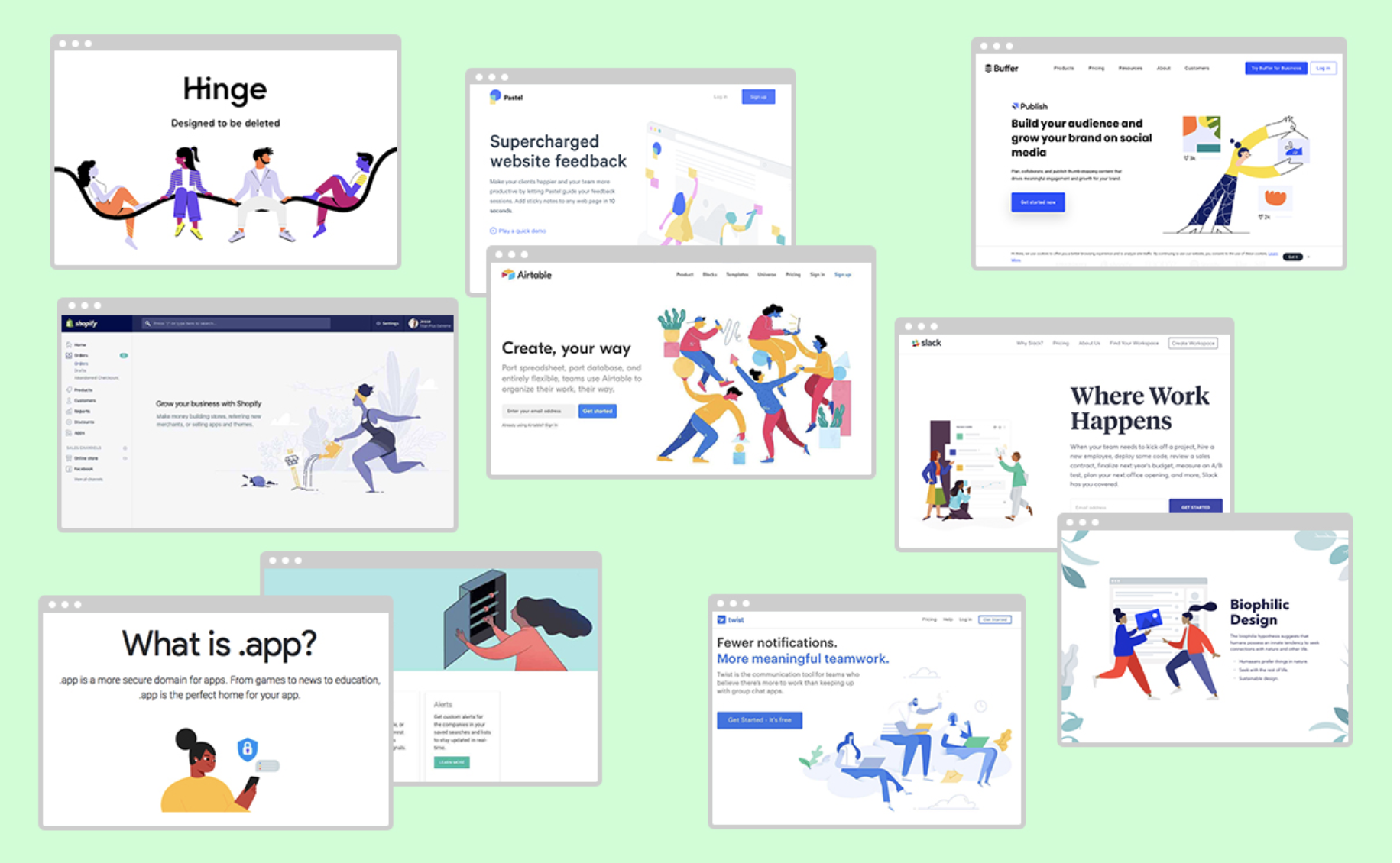
Facebook has become closely associated with this style, which its creators at Buck aptly dubbed “Alegria,” which is Spanish for “joy.” But the company is a fairly recent adopter of what has become an overwhelming trend in editorial and web illustration over the past few years, with particular prevalence currently in the realm of tech. Airbnb, Hinge, Lyft, Airtable, Google, and YouTube are all in on the craze, along with seemingly every other new app or startup in existence. For these companies, adopting a visual language that signals positivity and connectedness is a tool to paper over the social and political harm and divisiveness their products create—and illustration has increasingly become a centerpiece of the strategy.
Examples of Algeria-style illustrations used in the tech realm
How does a particular aesthetic achieve ubiquity in such a short period of time? There are practical answers, to be sure. The Alegria style lends itself to standardization and replication: Its flat figures are based on simple shapes and geometric patterns. On a project as large as Facebook’s illustration system, this means that many artists can contribute while keeping the look and feel of the characters consistent. Outside of the cash-flush tech sphere, in the world of editorial illustration, shrinking budgets and condensed production timelines may have something to do with the turn towards flat minimalism—more ornate artwork means more hours putting pen to paper, and fewer dollars per hour to show for it.
These technical considerations, however, fall short in explaining Alegria’s omnipresence. Xoana Herrera, an illustrator who worked on the Buck team for Facebook’s redesign, says that it was paramount for the illustrations to depict human motion and energy, and therefore joy and connection.
“I started to draw characters that were defined by their actions,” says Herrera, “dancing with their open arms, bending their bodies to play the trumpet, for example, human reactions that connect us. I wanted to portray that sense of joy we feel when we’re sharing things together in community, like celebrating a goal in a bar or singing a song with a crowd at a concert.”
As the internet becomes more image- and animation-oriented, tech and media spheres have grown increasingly reliant on illustration to fill white space and add character to their apps and web pages. The flat Alegria style has emerged as a simple, scalable, and image-softening tool for tech companies. Social media like the “Small cartoon people building big interfaces” and “Corporate Memphis” boards on are.na as well as the abrasive “Humans of Flat Design” Twitter account have taken to documenting the trend, which has spread across different brands, apps, and websites to the point of becoming unsettling.
According to Herrera, the Alegria style was intentionally modified for the sake of replicability during the development process and has since made its way through a number of illustration studios. “The style originally started as something more intuitive and complex,” says Hererra. “But after different reviews, it started to shift towards something simpler to copy and implement. There is a usage and illustration manual that has been passed through a lot of different studios around the world, so I think it’s now imprinted in many retinas at the moment.”
In a case study on her website, Herrera writes that the characters are “designed for expression, rather than individual identity. They are ethnically non-specific to represent diversity.” Orange or purple skin fits in naturally to the cartoon-y style of Alegria; if characters are depicted without reference to race, anyone can see themselves reflected in the characters. This logic also influences the characters’ idiosyncratic body shapes as much as technical considerations do. How do you avoid privileging certain people’s body types over others’ in your illustrations? Give your characters a body type that no one has.
Sketches by Xoana Herrera for Facebook Illustration System. Images courtesy of the artist.
While non-skin colored skin and wacky proportions characterize the vast majority of illustrations in this style, some companies have diverged from the one-sized-fits-all representation of raceless, shapeless characters. In a case study published on Airbnb’s website, illustrator Jennifer Hom noted that “a solution [to the challenge of diverse representation] that many land on is a kind of homage—a metaphor for diversity through rainbow-colored figures… Put simply, they’re not real.” Hom’s illustrations use many of the stylistic tendencies of Alegria, but opt for a wide variety of realistic skin colors, ethnic features, and body types.
Like many Alegria-style illustrations systems, it’s hard to scroll through the cheerful, cooperative figures in Airbnb’s case study and not be filled with a sort of utopian optimism. Human connection! Mutually beneficial transactions! That Airbnb is currently involved in a nationwide lobbying battle to get out of paying the taxes it owes to local governments across the country is an inconvenient aside, and one that has no place in any Alegria-adjacent paradise.
How do the cheerful, Mastisse-like illustrations that fill up the corners of any given Facebook page temper the expectations of people using these platforms? Their palpable joy is friendly, approachable, inviting, even—all of which translates to trustworthiness. Facebook has of course, proven to be one of the most untrustworthy public-facing companies in the world, repeatedly spying on users and leaking private data with impunity. Between the Cambridge Analytica scandal and other outrageous mishandlings like Facebook’s role in inciting genocidal violence in Burma, the company’s public persona is now more than ever in need of a face-lift. As a quasi-monopoly, Facebook seems to never pay for its sins in terms of usership decline—we’re all still there, staring at pages that have become cuter and bubblier as the company they represent grows more and more powerful.
The political predicament the Alegria style faces has less to do with the aesthetic itself than it does with the harmful corporations for which it has become the happy, kinetic face. The style appears to serve as the illustrative arm of an intentional deployment of cheerful minimalism to mask the insidiousness of multinational tech corporations with friendliness and approachability. Lindsay Ballant, art director of The Baffler, connects the style’s ascension with trends in global politics at the time.
“If you look at it globally, there were a bunch of austerity measures happening in 2014 in particular, and a lot of these repercussions of neoliberalism sort of hit globally then,” says Ballant. “It just seemed like there was a real concerted effort to mask that sort of stuff.”
In May, Ballant sharply divided illustrators on Twitter when she expressed her bemusement at the disproportionate number of illustrators sending her their Alegria-style portfolios. That the style is being frequently pitched to a leftist magazine, of all places, speaks to its overwhelming saturation, Ballant argues. “Some areas of the design world are going through reckonings of what class and identity mean,” she says. “Especially for an industry that goes out of its way to tell itself that its doing world-changing, feel good things. But I think that maybe the illustration industry hasn’t quite had that reckoning.”
In time, all trends reverse themselves, and there’s no evidence to suggest that the Alegria style will prove an exception. What the next illustration trend to take up roost in the tech sphere will communicate depends on how our relationship with technology evolves in the coming years and decades. For what it’s worth, Herrera thinks the Alegria style’s legacy will live on in the world of illustration. “I believe that, [like] many trends, this will pass,” she says. “And in the future, [Alegria] might be taken as reference for some really new and exciting style.”